Project Type
Role
Timeline
HackBAC is a social justice hackathon designed for middle and high school students (grades 8–12), with a mission to empower BIPOC youth through design thinking and innovation. As part of a UX design team, we were tasked to build HackBAC’s website to better reflect its credibility, showcase past success, and streamline the registration process.
The Problem
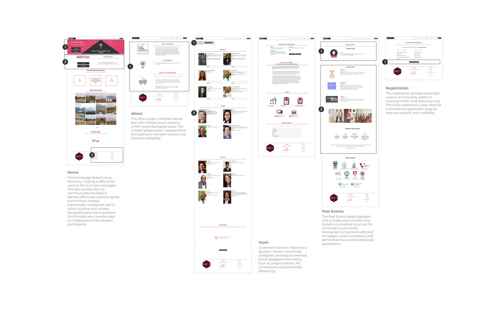
HackBAC’s existing web presence was fragmented across multiple pages under a larger organization’s site, making it difficult for users (mainly DEI coordinators and school decision-makers) to quickly understand what HackBAC is, how to register, or why the program is credible. While a prototype for a standalone site had been created in the past, it remained unpublished and outdated, requiring revisions to reflect current goals and content needs.
*One key constraint provided by the client was that the final website had to be built using Squarespace, meaning our designs needed to be both user-centered and fully feasible within the platform’s layout and feature limitations.
Project Goal
The goal is to create a standalone website that clearly communicates HackBAC’s identity and mission, h ighlights the success of past events, and improves registration flow for DEI coordinators.
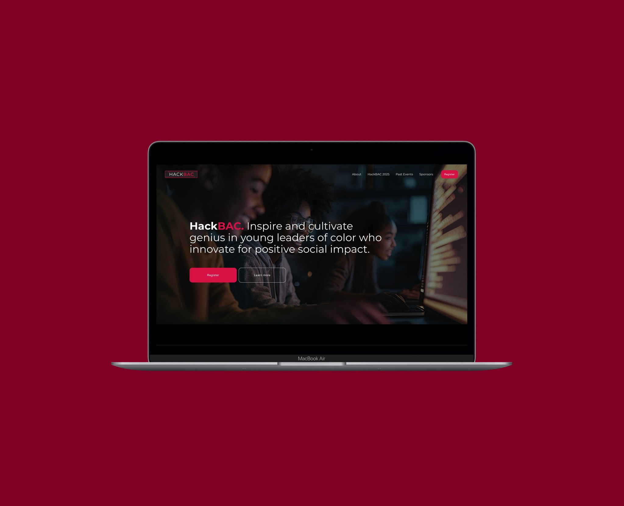
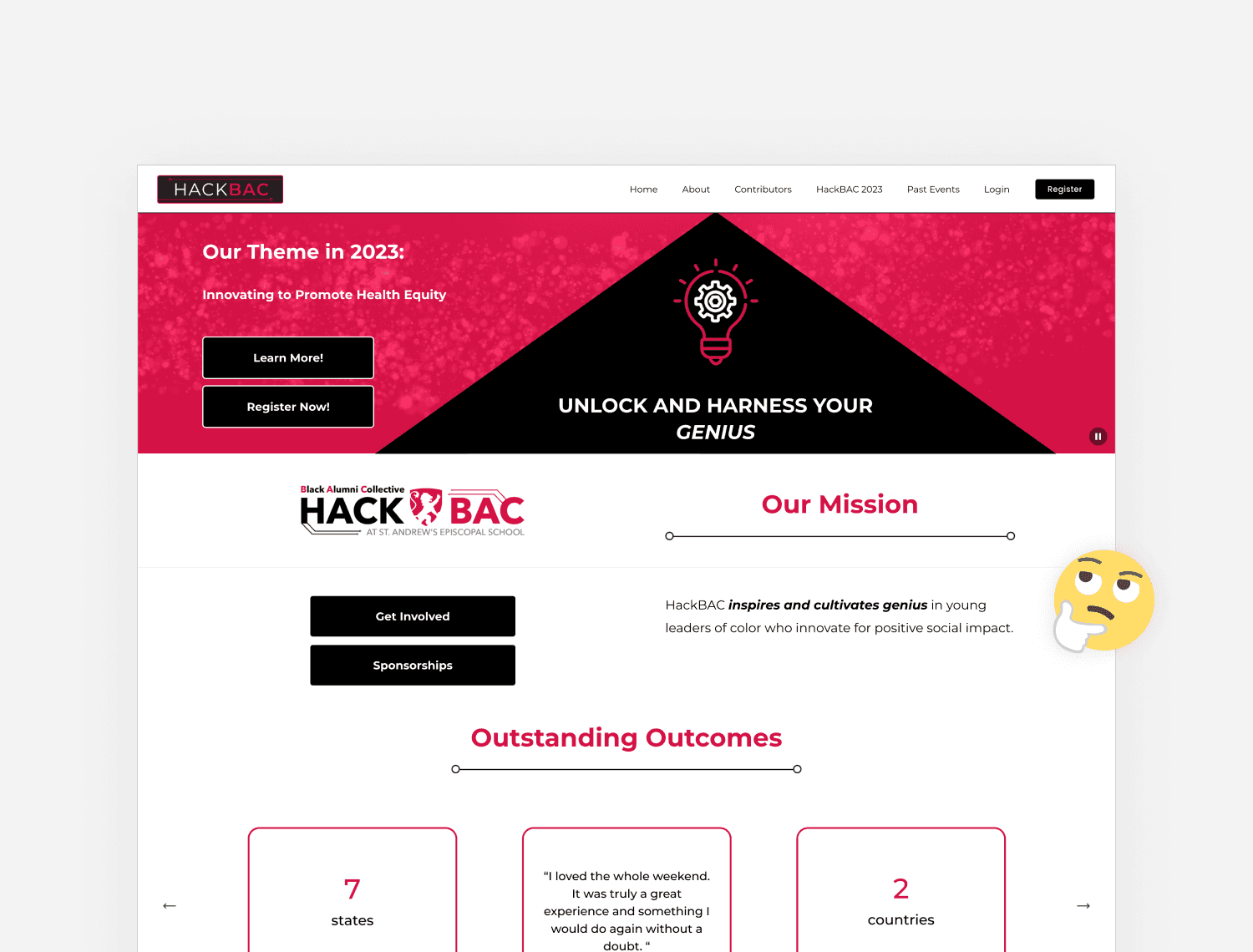
Home
Upon arrival, users are introduced to HackBAC’s mission and value proposition, providing a clear and immediate sense of the organization’s purpose. Prominent calls-to-action (Register & Learn More) are strategically placed to encourage user engagement. The page also features an overview of the upcoming event and showcases past program outcomes through curated testimonials, participant photos, and partner logos. A persistent call-to-action banner above the footer offers a final prompt to register.
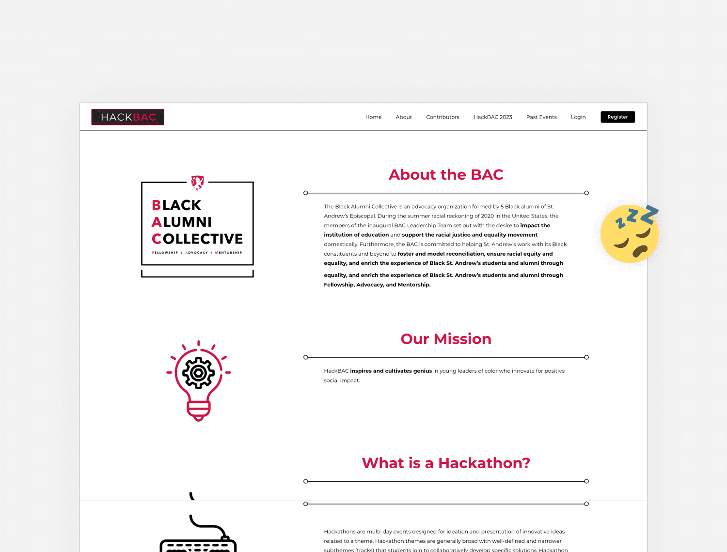
About
The About page presents a concise yet informative overview of HackBAC’s background, values, and objectives. It also includes a detailed FAQ section to proactively address common inquiries from potential registrants, particularly DEI coordinators. The content is structured for easy readability, supporting efficient information gathering.
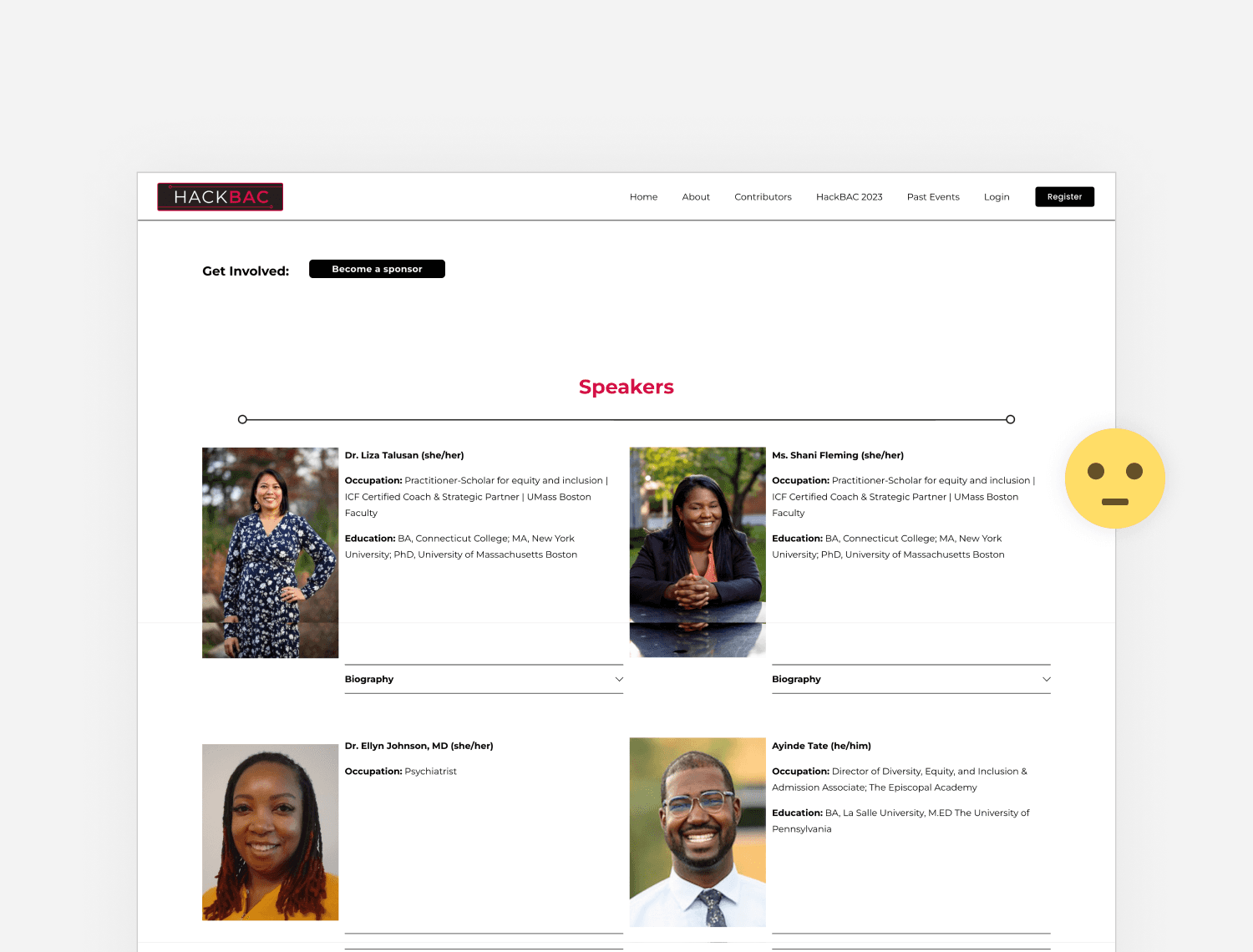
Team
Team page introduces the individuals behind HackBAC, reinforcing transparency and trust. Team bios and professional photos help users, especially school decision-makers, connect with the people running the program, thereby enhancing HackBAC’s credibility and approachability.
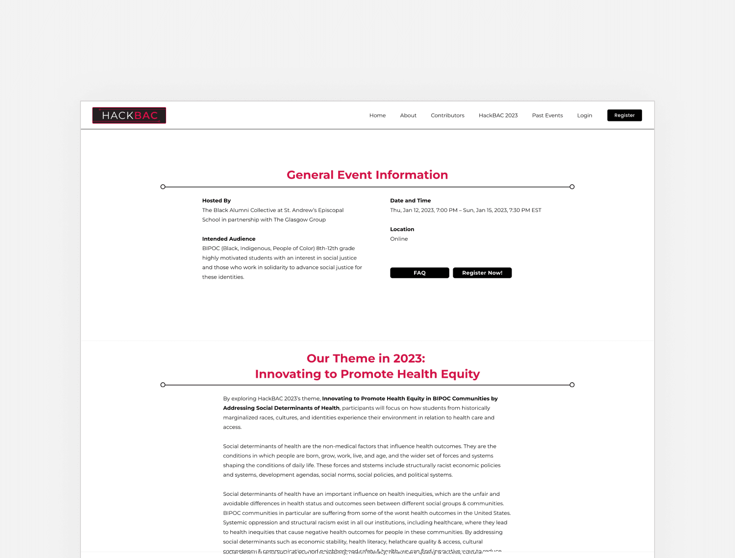
Event Detail
The Event Detail Page is designed to meet the specific informational needs of school leaders and educators. Key logistical details, such as event dates, location, and eligibility criteria, are prominently displayed at the top for immediate visibility. Further down, the page presents event details including annual theme and student challenge prompts (tracks), with highlighted keywords to enhance scannability and ease of reading.
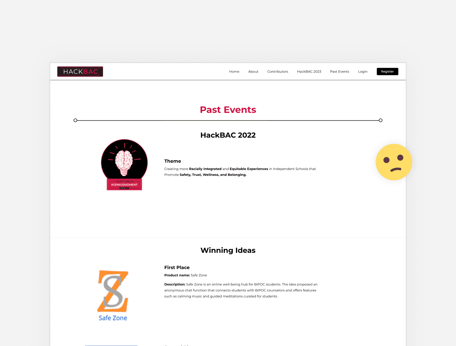
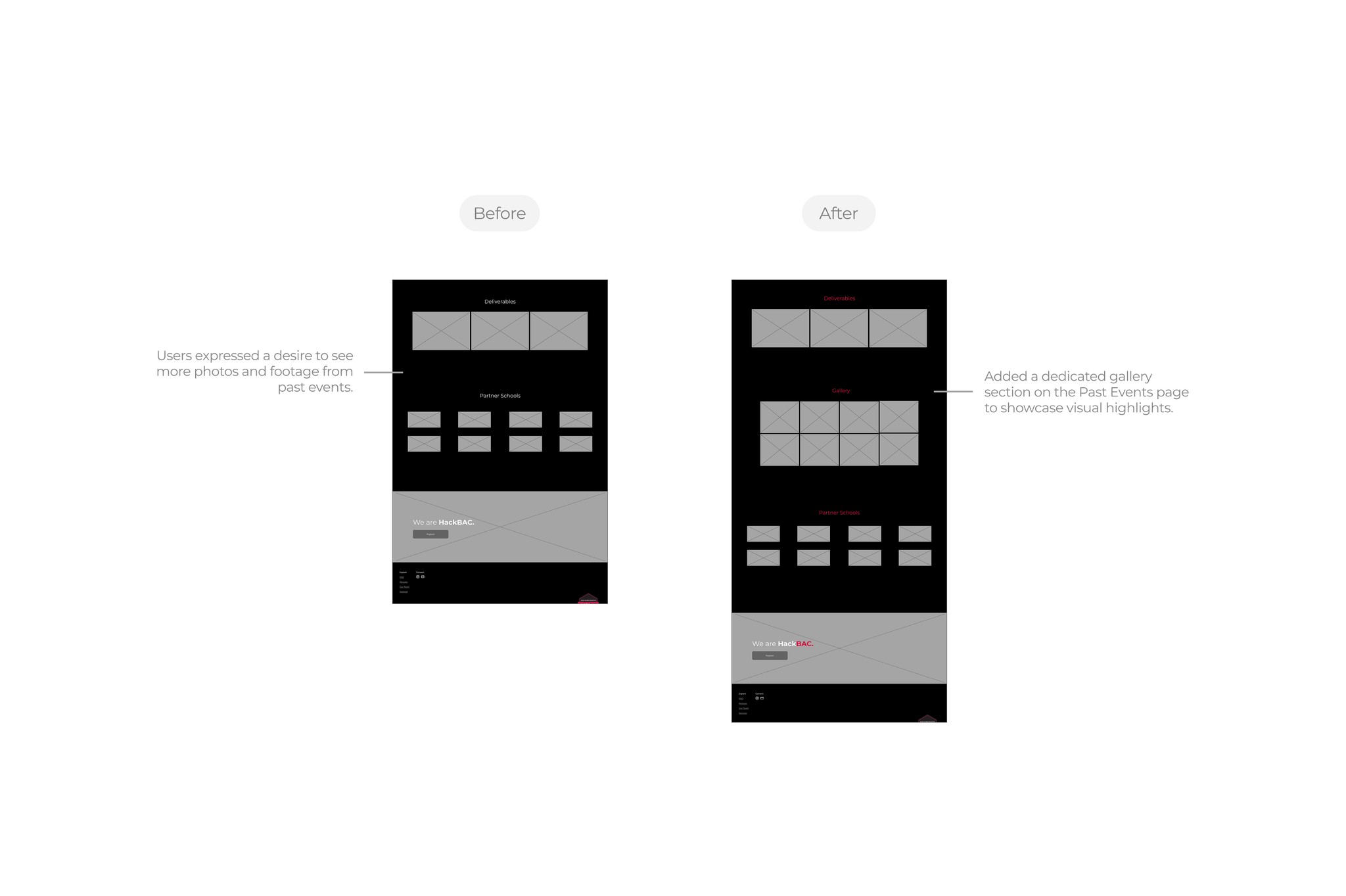
Past Events
Past event page showcases HackBAC’s track record and long-term impact through a chronological gallery of past events. Users can view previous years’ themes, student projects, participating schools, and media documentation (photos, videos). This content plays a key role in establishing the program’s credibility and outcomes.
Sponsors
Sponsor page is designed for individuals and organizations interested in supporting HackBAC, outlining available sponsorship opportunities and the broader impact of contributing to the program. It also features a list of previous sponsors, further reinforcing HackBAC’s network and legitimacy.
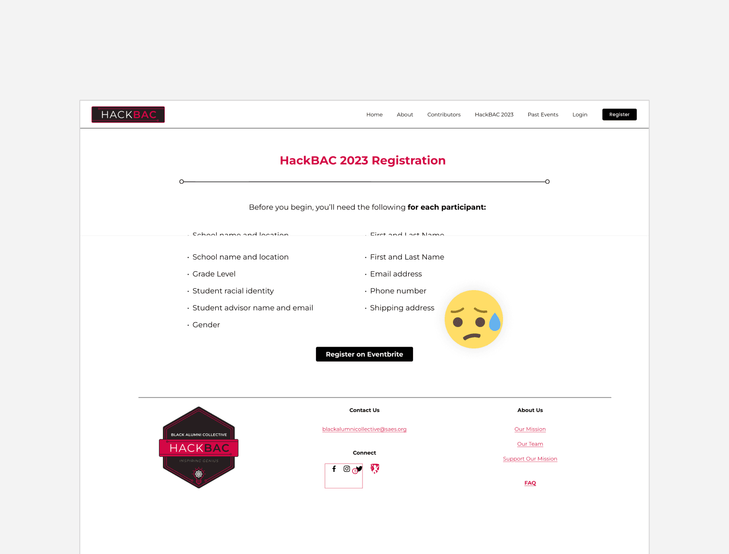
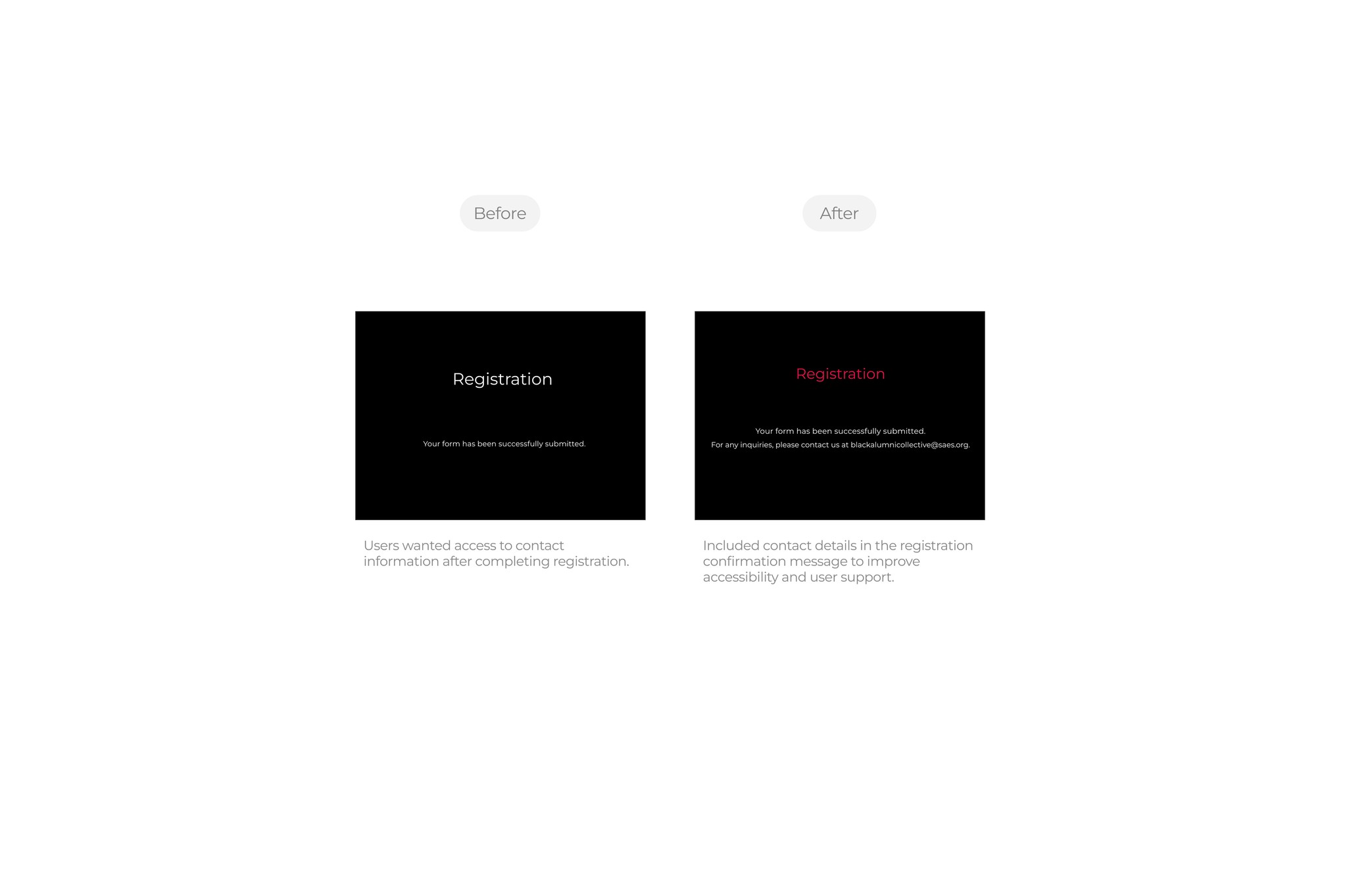
Registration
A standalone registration page was a key requirement from the client. This page features a streamlined, on-site form that eliminates the friction caused by third-party redirects in the previous version. Its structure is intuitive and clearly presents all required fields and instructions, resulting in a more efficient, seamless, and trustworthy registration experience.
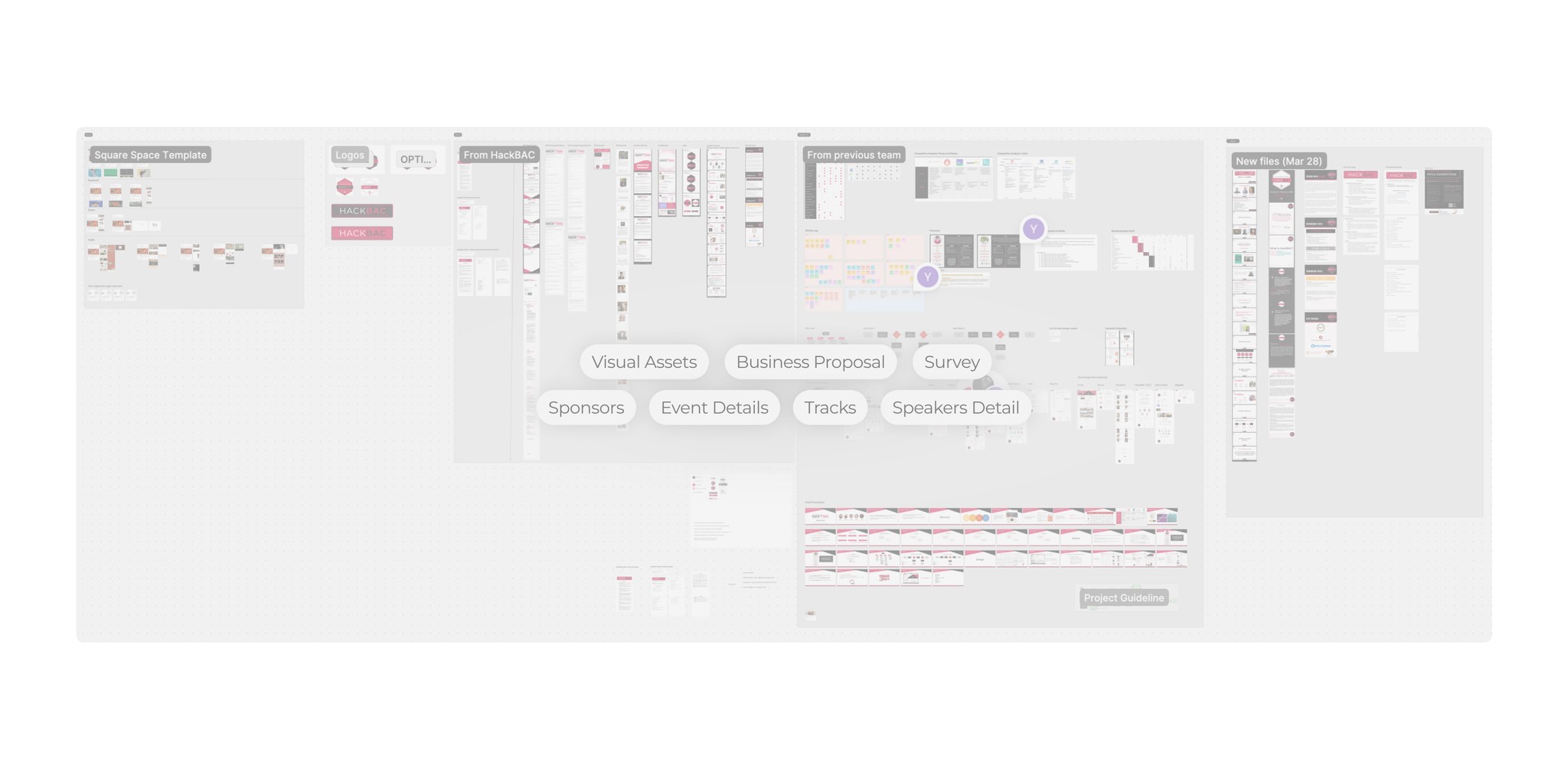
Understanding
The client provided a substantial amount of assets and information, ranging from business proposals and past event materials to visual branding assets. To begin, we organized and analyzed all provided resources to gain a clear understanding of HackBAC’s identity and the unique value it offers to users.
With that foundation, we began our research by conducting a site audit of the existing web presence. This allowed us to assess the current content, structure, and user touchpoints, helping us identify how HackBAC was (or wasn't) communicating its mission, offerings, and credibility through its digital presence.
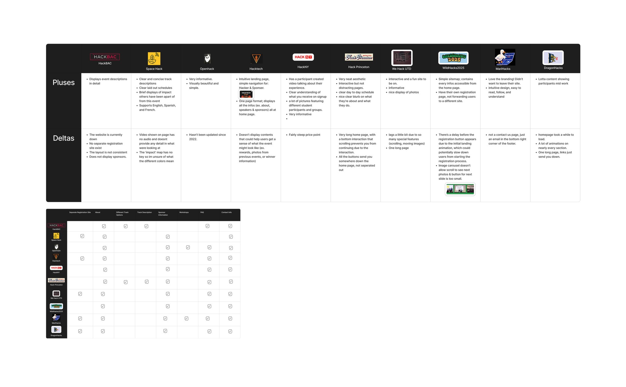
Audit & Comp Analysis
With that foundation, we began our research by conducting a site audit of the existing web presence. This allowed us to assess the current content, structure, and user touchpoints, helping us identify how HackBAC was (or wasn't) communicating its mission, offerings, and credibility through its digital presence.
Navigating Challenges
One of the key constraints in this project was the requirement to build the final website using Squarespace, a platform our team had no prior experience with. This added a layer of complexity, as we had to quickly familiarize ourselves with its capabilities while also working within its limitations in layout flexibility, fixed components, and restricted customization options.
Additionally, there were delays in receiving contact information for potential user interview participants from the client. Given our tight 3 week project timeline, we used this waiting period to study Squarespace’s features and limitations in-depth and began structuring the website framework early, ensuring we could move forward without losing momentum.
Interviews & Affinity Mapping
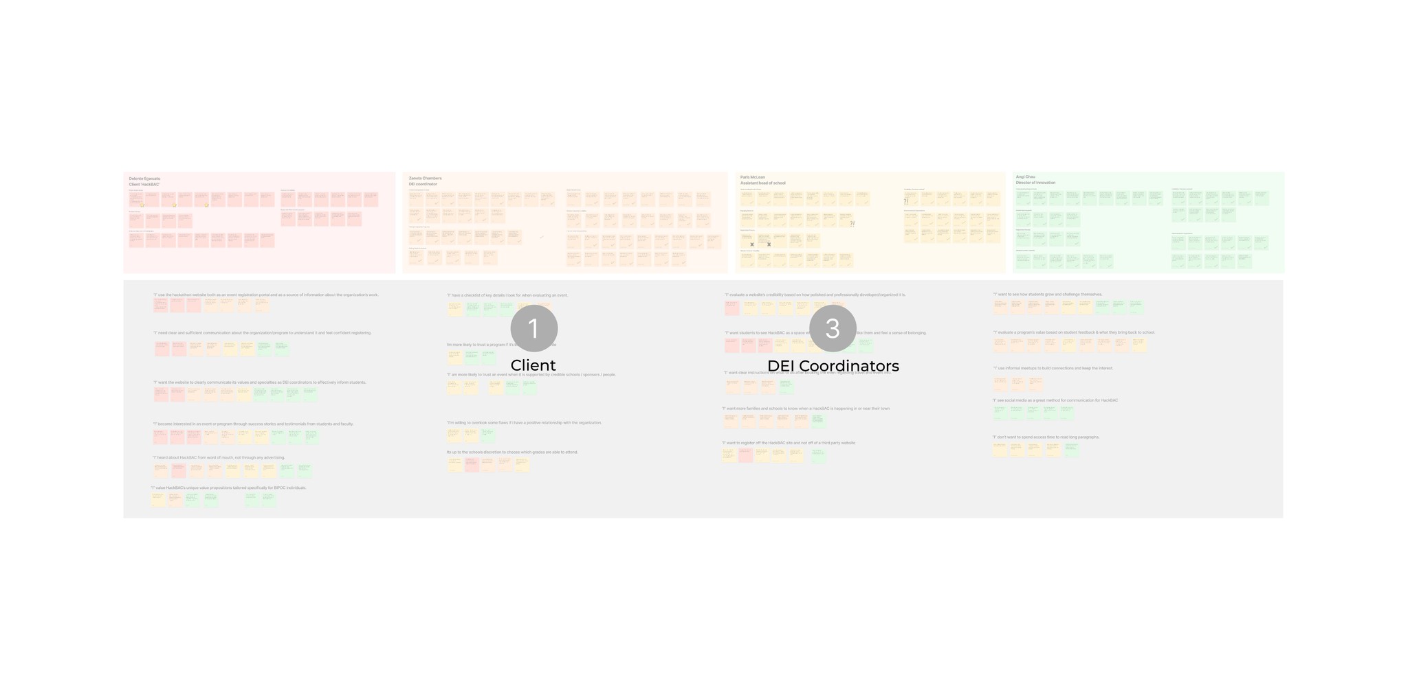
Once we received contact information for key stakeholders, we conducted interviews to better understand how users discover programs like HackBAC, what information they prioritize, and the challenges they face during decision-making and registration.
To identify shared patterns across different stakeholders and surface the most pressing issues, we organized the findings from interviews into an affinity map. Clustering quotes and observations allowed us to clearly define user needs, highlight common pain points, and uncover actionable design opportunities that informed the next phase of our process.
Design Opportunity
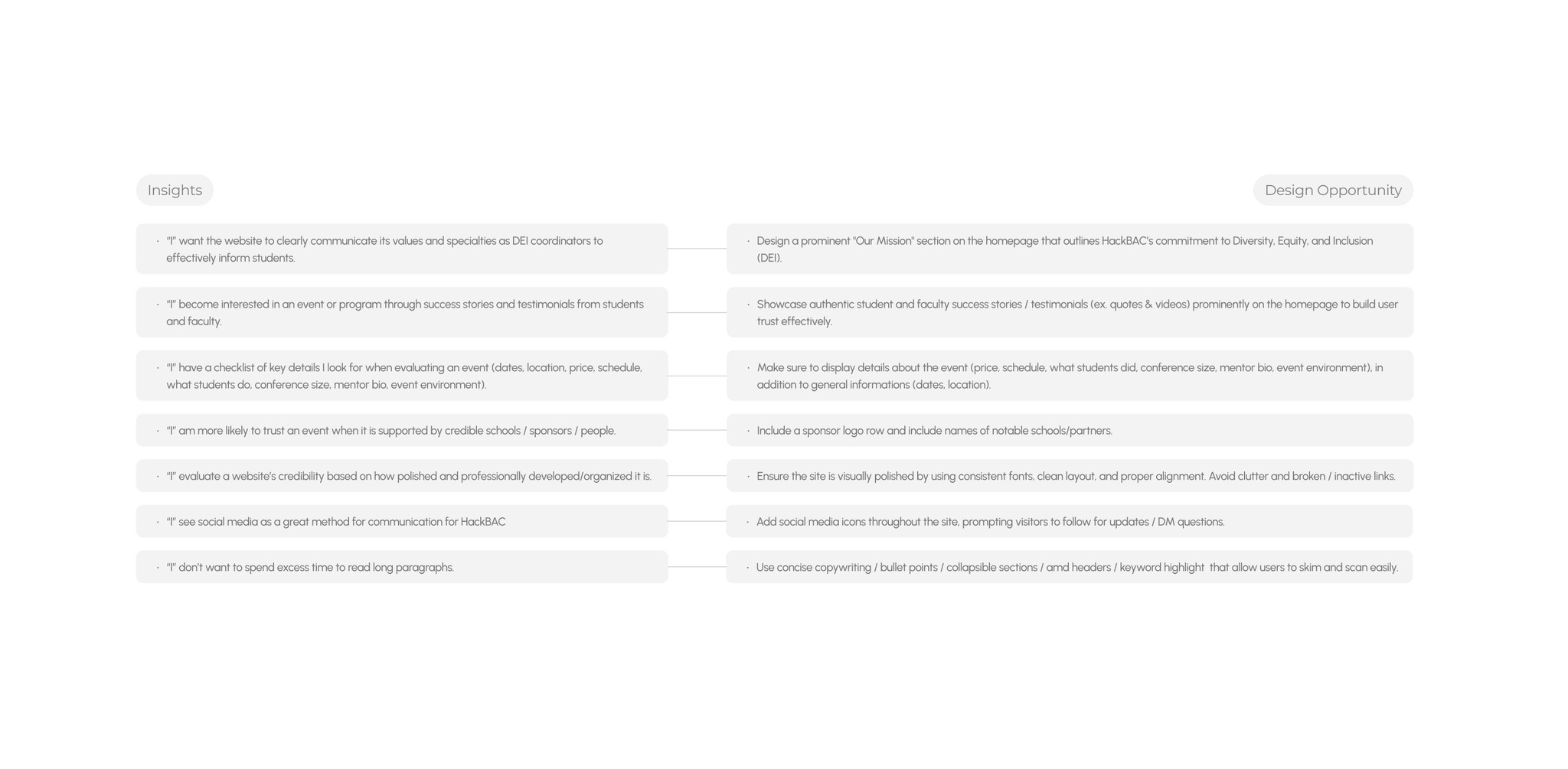
Through our research, we identified key insights that revealed shared frustrations among stakeholders, including hard-to-navigate websites, a lack of past program results or testimonials, and limited time or patience to sift through disorganized content.
These findings led to several clear design opportunities: prominently showcasing HackBAC’s mission and past success stories, surfacing essential logistics early (such as event details, cost, and eligibility), improving the registration experience with a clearer call-to-action and integrated form, and using visual storytelling, through photos, testimonials, and student projects, to quickly establish trust and generate interest.
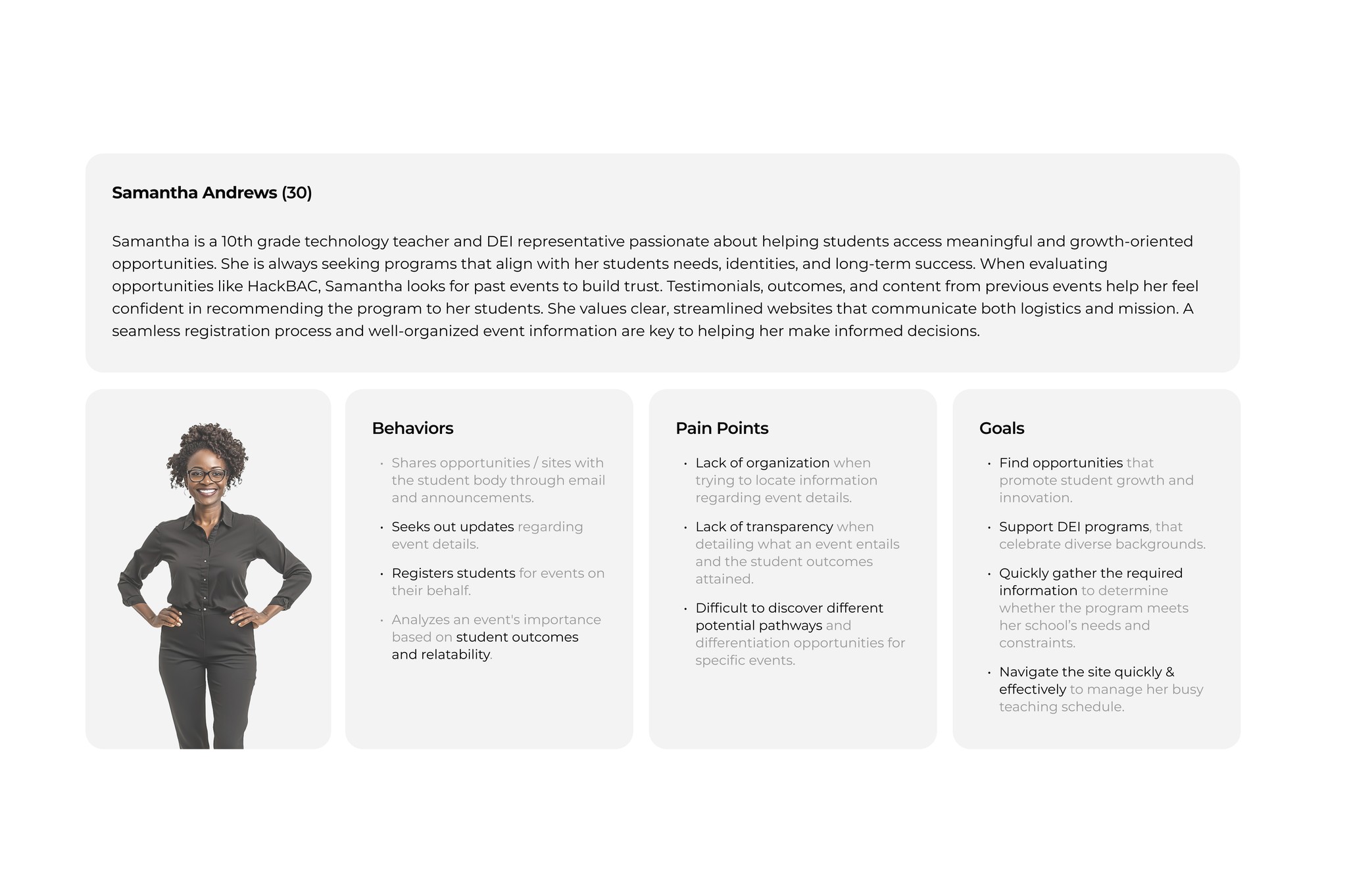
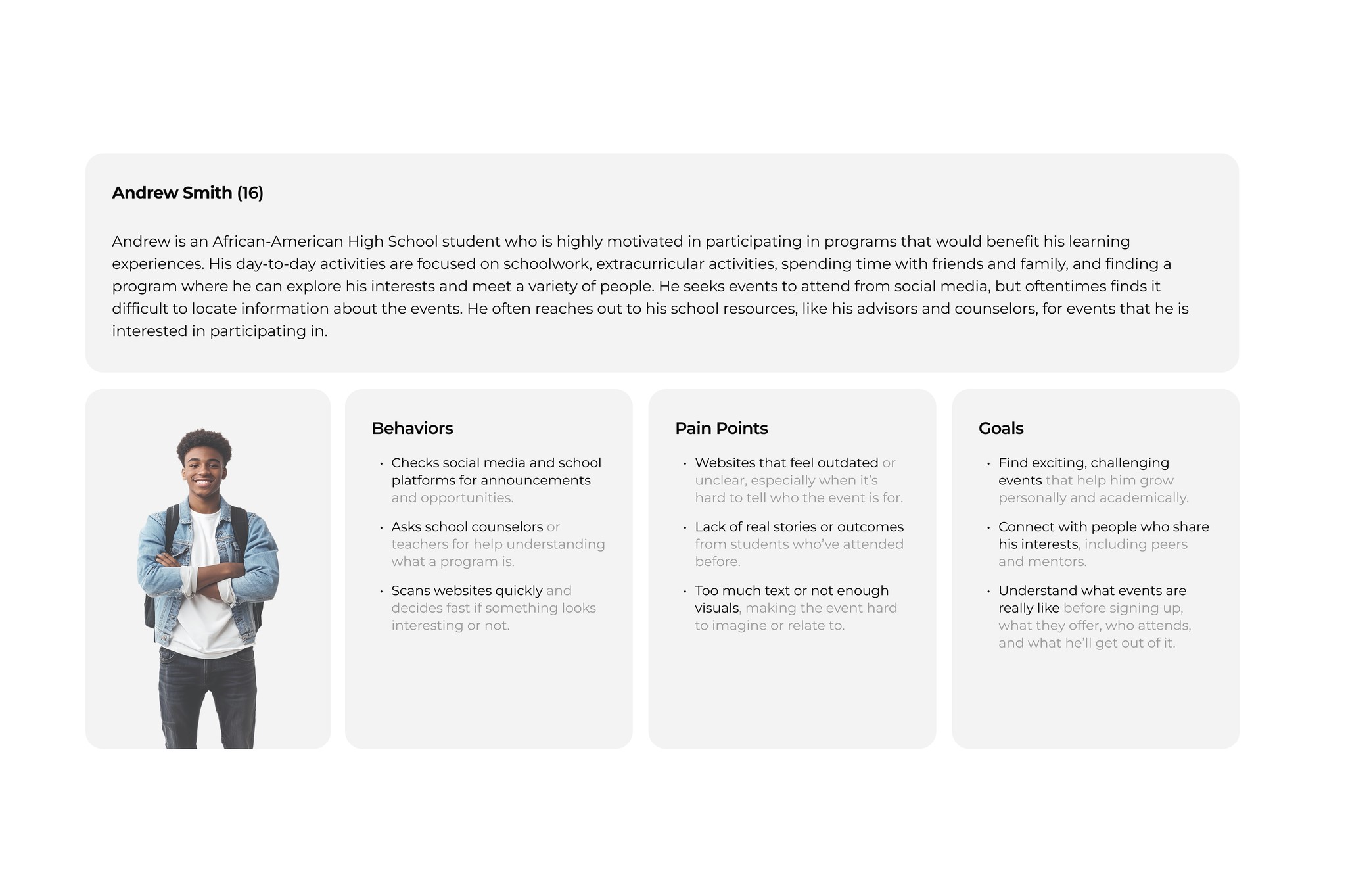
Persona
Based on our research, we developed two key personas: Samantha, a DEI coordinator who wants to provide meaningful experiences for her students but needs clear, credible information before recommending programs; and Andrew, a curious and motivated high school student who seeks engaging opportunities but often struggles to find or access the right information.
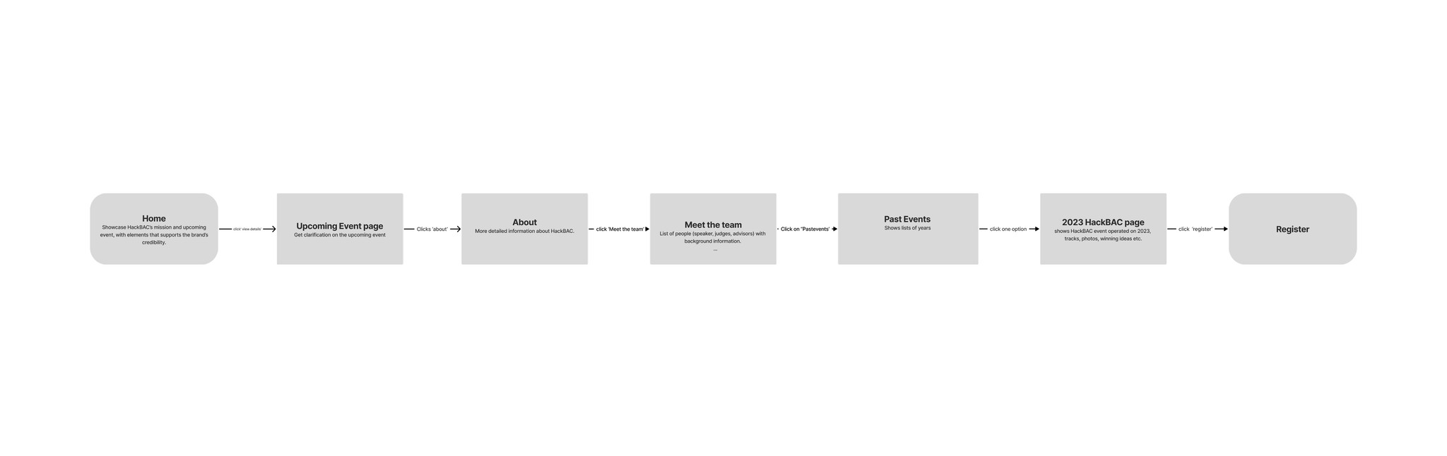
Task Flow
After, we created a task flow that reflects how the targeted user, DEI coordinator, might navigate the site from first landing to registration. The journey begins on the Home Page, where users are introduced to HackBAC’s mission and value. From there, they explore the upcoming event details, build trust through team bios and past event highlights, and ultimately proceed to register their students. The site’s information architecture was intentionally designed to guide users through this flow intuitively while reinforcing credibility at each step.
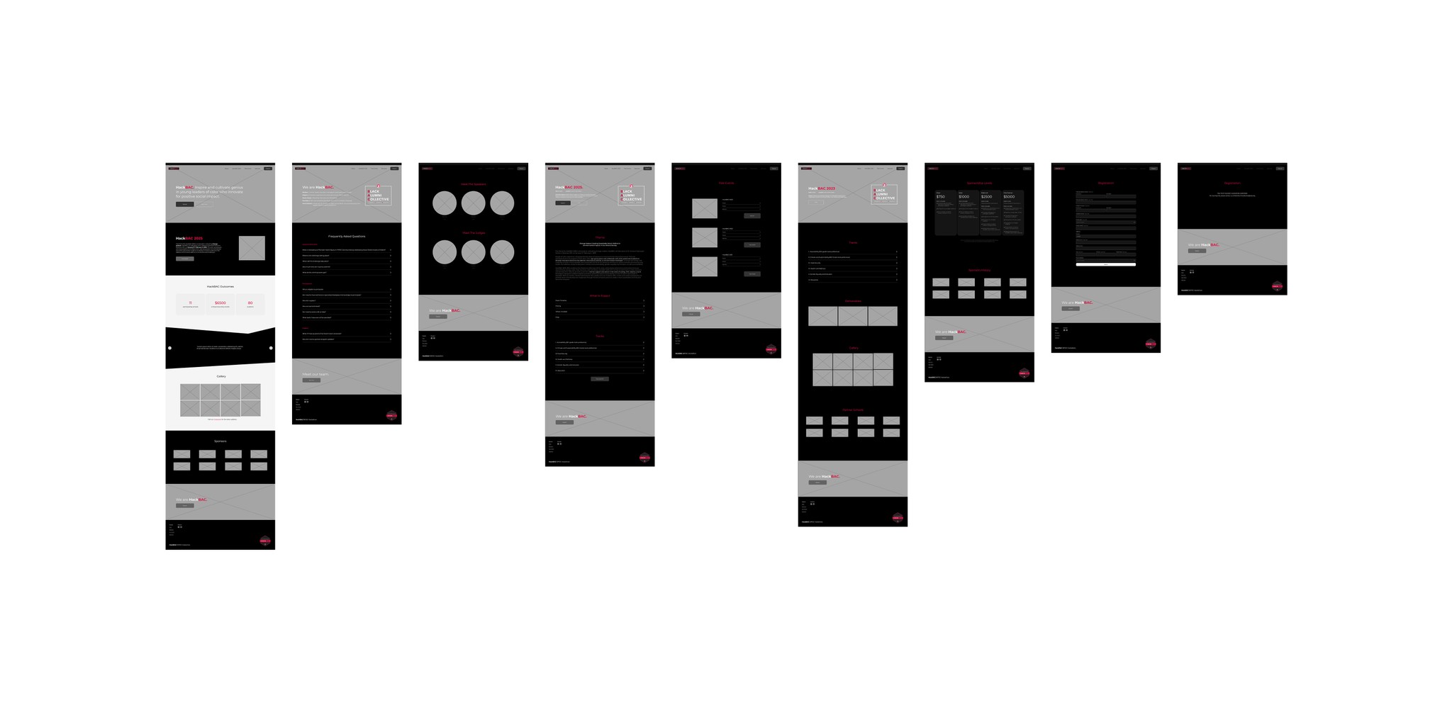
Wireframing
With the task flow and design opportunities defined, we created wireframes that prioritized both user needs and the technical constraints of Squarespace. The layouts were intentionally kept simple and modular to ensure they could be implemented smoothly within the platform’s limited customization options.
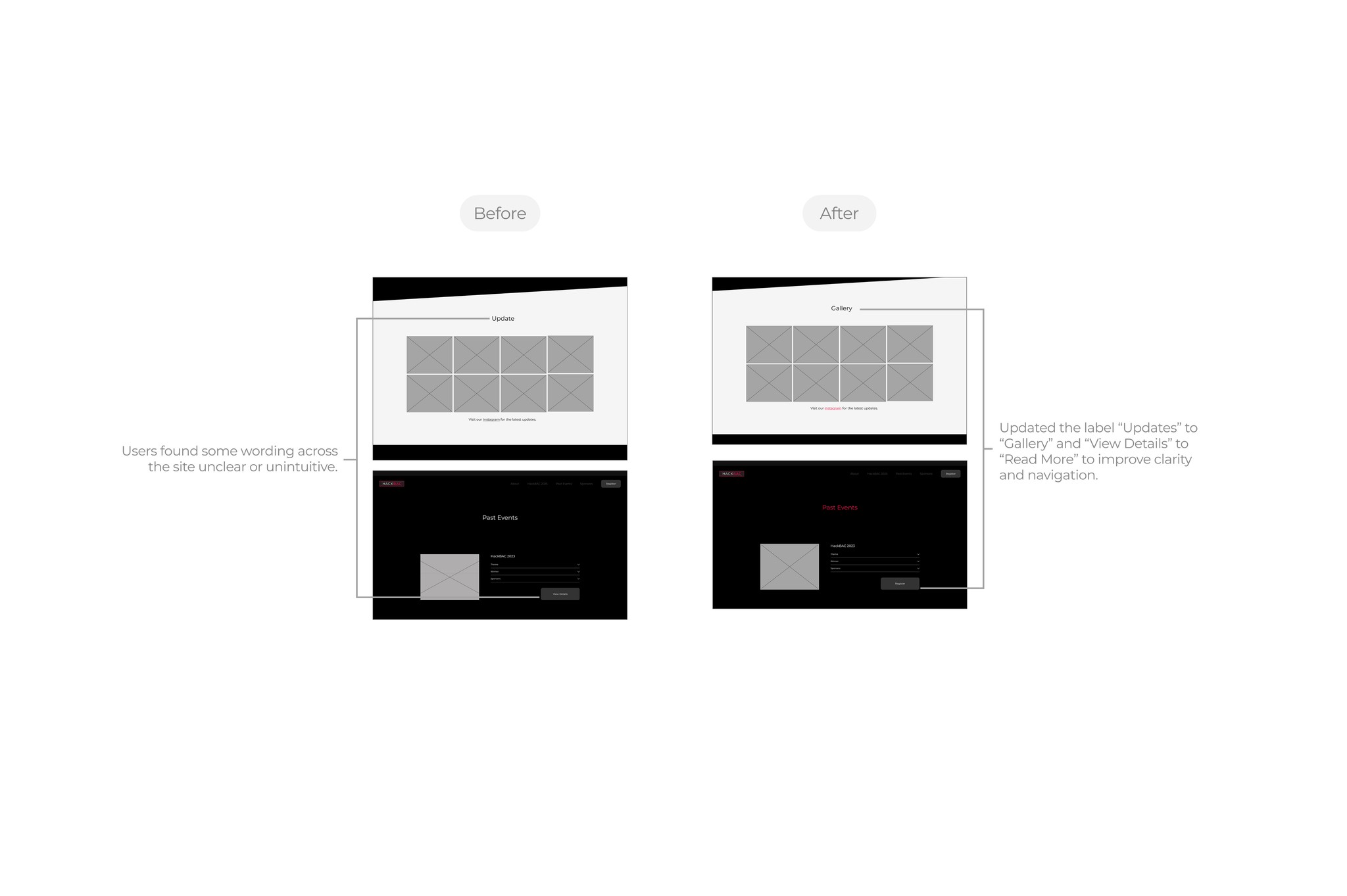
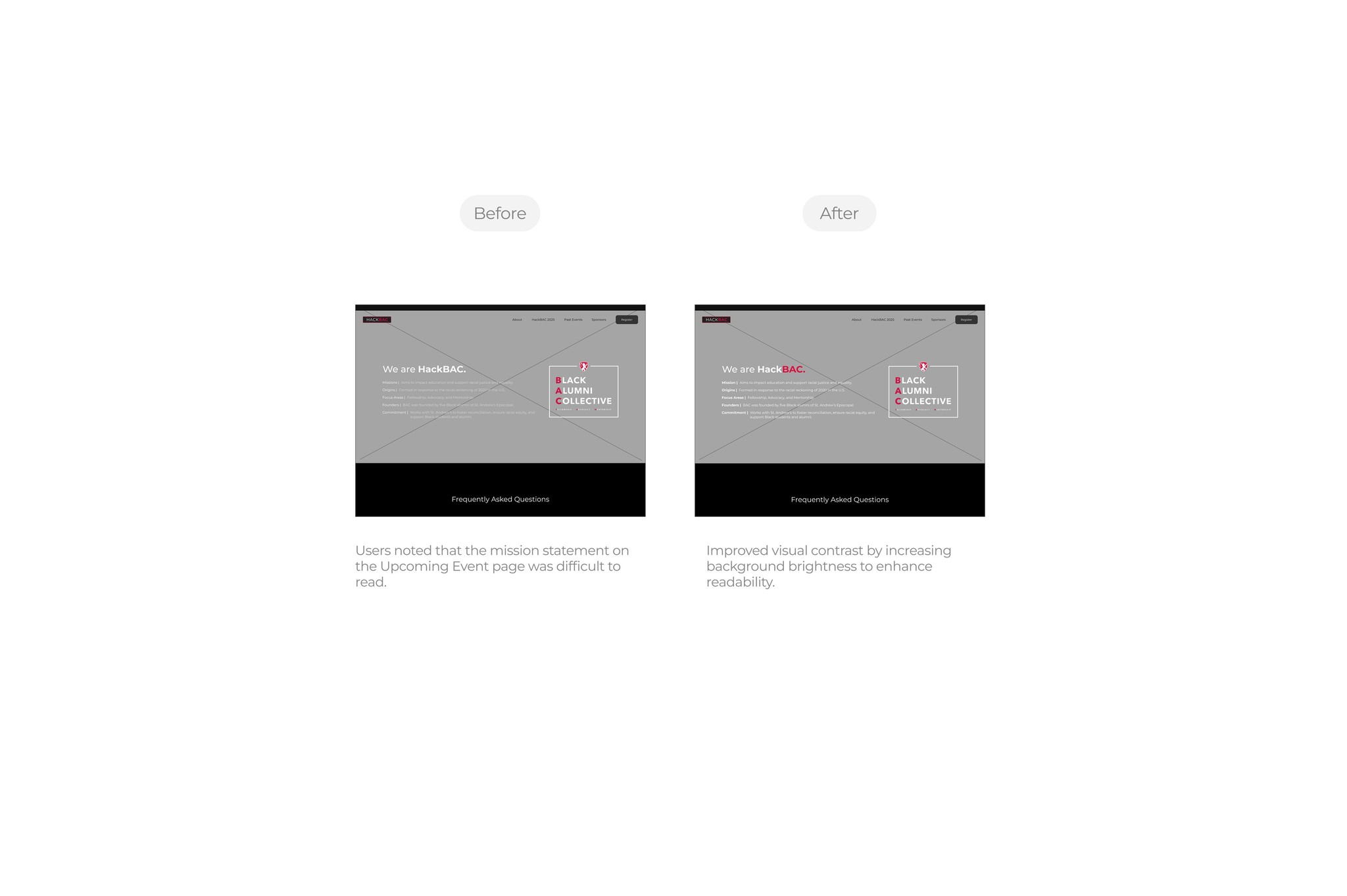
Usability Test
The wireframes underwent several rounds of usability testing with potential users, who were asked to explore the site, assess its credibility, and complete the registration flow. Overall, participants found the navigation intuitive and the structure easy to follow. Most feedback focused on improving the accessibility and visibility of specific content, which directly informed key revisions in our final design.
Final Website
This project taught me how to balance user needs with platform constraints (Squarespace), communicate value through visual storytelling, and collaborate closely within a design team. It also deepened my understanding of how credibility is built through structure, tone, and content.